5 case studies in increasing mobile app retention

For a while in Silicon Valley, building an app was the name of the game. Remember Apple’s ubiquitous tagline: “There’s an app for that”. These five words reflected key priorities of many tech companies at the time. Getting users as fast as possible was the goal; creation, not retention, was the focus.
Now, the market is sophisticated. App design and user strategy have developed far beyond what those early apps could do. Keeping users is the focus today, and we’ve got mobile app retention strategies to help.
Mobile app retention: Terms to know
Many of these terms have been covered on Sendbird’s blog, but in case you need a refresher, we’ve defined the key vocabulary in mobile app retention below.
Active user: A user who engages with a mobile app in a given period of time; developers measure this every day (daily active users, or DAUs) and every month (monthly active users, or MAUs).
App retention: The percentage of users who return over a given period of time. Some people measure app retention at one month, two months, and three months after download; others measure it after day 1, day 7, and day 30.
Churn: The percentage of users who do not return to the app over a given period of time; churn is the inverse of retention.
DAU/MAU ratio: An app retention metric that measures how active monthly users are on a daily basis; also known as “app stickiness.” A DAU/MAU ratio of 20% is considered good, according to Business of Apps’ retention strategy guide.
User acquisition: Any strategy used to drive app downloads; also called mobile user acquisition.
Mobile app retention: The challenge by the numbers

Most app users churn, either uninstalling the app or simply never reopening it. A 2019 study of 37,000 apps across industries found that:
One month after download, ~42% of users stuck around, while ~58% churned.
Three months after download, only ~27% stayed, and ~73% of users churned.
Statista’s research on global app retention in Q3 2022 paints an even grimmer picture for developers:
On Day 1, ~26% of iOS users and ~23% of Android users stayed.
By Day 30, only ~4% of iOS users and ~3% of Android users were still engaged with the app.
Why does churn happen with mobile apps? The answer is unique to every business, but there’s likely a constellation of factors at play, such as:
User experience (UX): Maybe the app is ‘buggy,’ or the UX is confusing, and the user struggles to take the intended action (e.g., placing a delivery order).
Low value: The app doesn’t solve pain points in target users’ daily lives.
Lack of incentives: If not compelled to use a new app, users might simply forget about it; changing people’s routines (e.g., their prescription ordering process) doesn’t often happen naturally or spontaneously.
How can you build an app that actually retains users? The answer is layered and unique to every business, industry, and audience. Keep reading for our analysis of five B2C companies’ tactics and how to leverage them in your app.
5 companies with strong, creative app retention strategies
Creating an engaging user experience is essential for app retention. Sounds simple, but the apps with the best retention rates have likely worked hard to acquire — and keep — their active users.
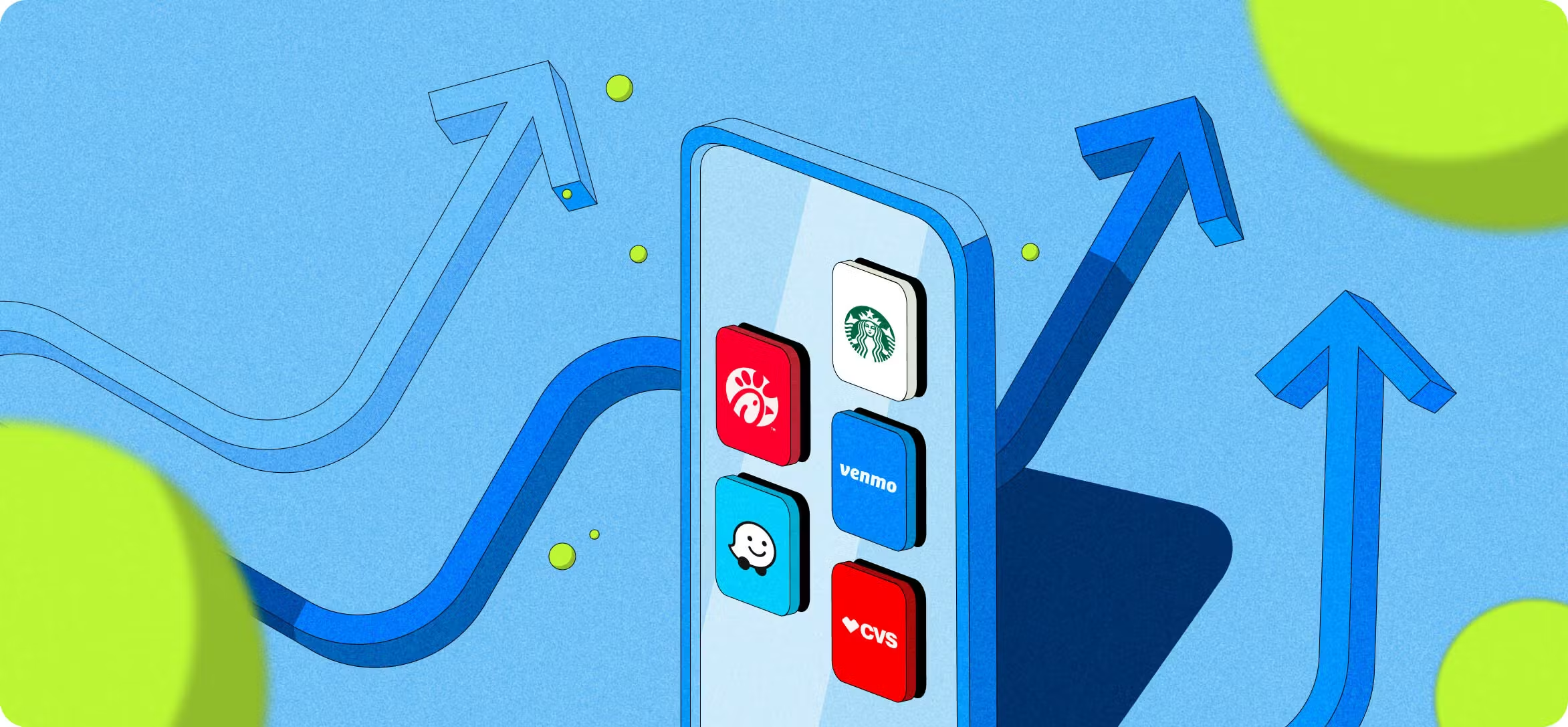
#1: Chick Fil A
Tactic: Rewarding engagement
Chick Fil A’s rewards customers who engage in the app with promotions and points (10 points for $1). They can start redeeming their points at a relatively low threshold (200 points, or $20, as of publication). Contrast this with other restaurant apps, where earning enough points to redeem takes months.
Chick Fil A also occasionally rewards customers for just opening the app. For example, I recently opened it and got a pop-up coupon for free nuggets (“Hello Spring. Hello Nuggets”).
#2: CVS
Tactic: One easy platform
Gone are the days of chaotic newspaper inserts full of ads for Easter candy and stuffed bunnies in January. Users can accomplish all their health-related tasks — scheduling appointments, finding deals, refilling prescriptions — in CVS’ single, streamlined app.*
*However, CVS then follows up with patients by SMS, a disjointed user experience. At Sendbird, we help companies create a more seamless experience by housing all your customer communications within your app.
The front-end app design is also worth noting: simple words, straightforward instructions, and accessible design (e.g., high-contrast text).
#3: Starbucks
Tactic: Gamification
Similar to Chick Fil A, Starbucks customers earn points (stars) for every dollar spent. But there’s a twist, according to UX designer Kimberly Dsilva. Starbucks gives users boosts and bonuses toward earning rewards, such as “Double Star days” and “Bonus Star challenges.”
This tactic is rooted in the Goal Gradient Effect, the UX principle that giving users a faster path to their first rewards keeps them motivated to continue, according to UX designer Kimberly Dsilva’s analysis.
#4: Venmo
Tactic: Fun
Venmo got to the party about a decade after PayPal but stood out by making payments (somewhat) entertaining. Like social media apps, users can like and comment, use emojis and gifs. This tactic may not fit every brand, especially B2B, but for a B2C company with a younger target demographic, these special touches shaped an engaging experience that attracted more and more users.
#5: Waze
Tactic: Customer-centered value proposition
Waze entered the navigation app market in 2006, going up against none other than Google and Apple. Predictably, its user experience wasn’t as strong. But Waze differentiated itself by solving pain points that these giants hadn’t touched. The app helps drivers avoid speeding tickets, alerts them to obstructions ahead, and reroutes them based on live traffic reports. By finding and filling unmet customer needs, Waze created an app that drivers rave about.

How does your mobile engagement score stack up?
An app is only as good as the technology behind it
At Sendbird, we can help you build an engaging app experience that keeps users coming back. Get started with a demo.


